The Default Darktable Themes are Shit – So I Made a Better One
The antidote to darktable's nightmarish design
T
here is no doubt at all that Darktable is a powerful RAW editor – arguably the most powerful of them all – but it is also one of the most confusing apps I’ve ever used. I can categorically state that one of the reasons I’ve never made a concerted effort to learn this app is because I just hate its infinitely brown interface of shit inter-connecting sliders.
The design of this app seems to have been purposefully created to instil a sense of tool-blindness in anyone that’s using it. The array of identical sections with identical sliders make it impossible to use instinctively, flicking from one slider to the next when constructing an edit. Every change is an exercise in squinting at the screen and trying to work out what combination of icons and sliders will get you to the right tool.
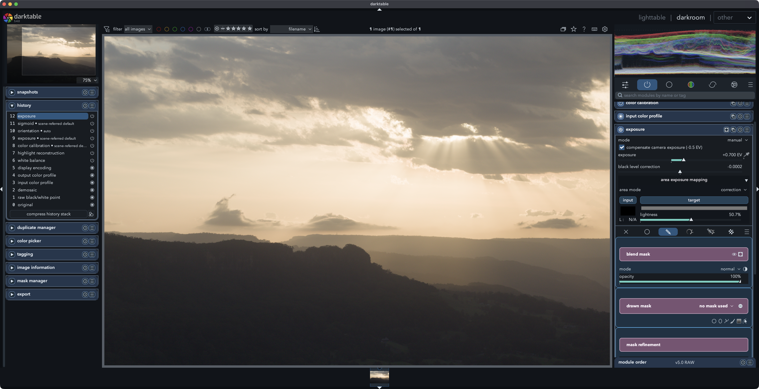
And when I realised that the tool-blindness was a symptom of an interface designed by colour-blind sadists, I decided to do something about it. I sat down and worked out what was wrong with it and how I could improve it and then, with the able assistance of OpenAI’s Codex I made a custom theme that addressed those issues.
The first change was to rework darktable’s interface to feel cleaner, more structured and easier to scan without changing the app’s behavior. The main shift was from a flatter, more utilitarian UI to a card-based layout with clearer module separation, stronger typography, and a calmer low-glare palette.
I tested quite a few fonts to find a better option and settled on Switzer, so labels and controls read more clearly. Then I turned the sidebar modules into distinct cards with rounded corners, borders and more breathing room.
I added coloured module headers so each tool block is easier to identify at a glance, styled subsection labels and the blending/mask area as separate nested sections, so complex modules don’t blur together and improved spacing and padding across left/right panels to reduce the cramped feel.
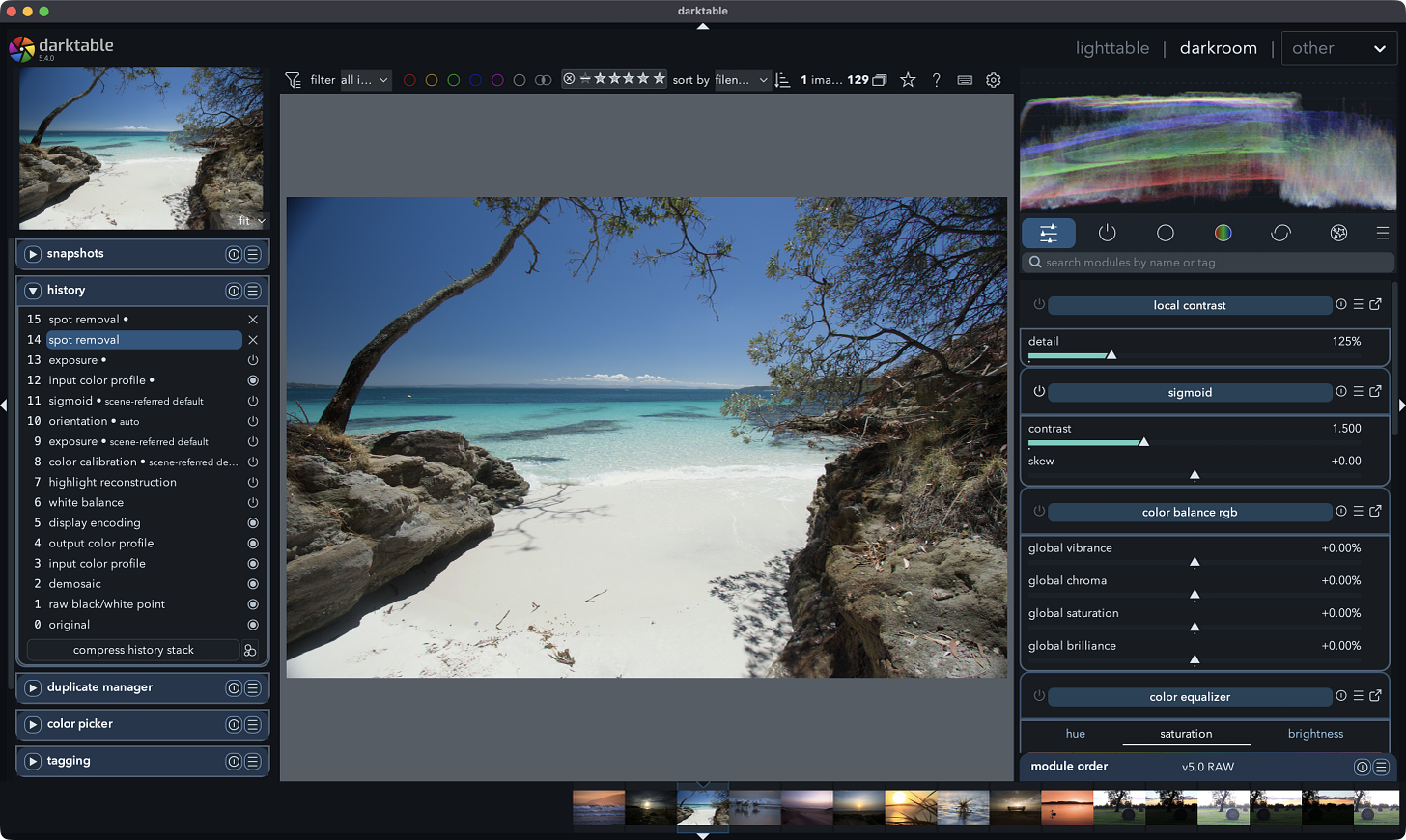
With that looking better I refined buttons, inputs, sliders, tabs, and hover states, turned the palette to a modern graphite base with restrained blue/cyan accents and a few warm highlights for selection/hover states.
Finally, I kept the darkroom background at a middle grey so the image view stays usable and doesn’t disappear into an overly black UI and I cleaned up thumbnail and filmstrip states so hover, selection, and overlays are easier to read.
You can find the theme, instructions and the Switzer font in a zip file, which you can download below. If you like the theme, let me know.
Also published in RAW & Unfiltered on Substack.